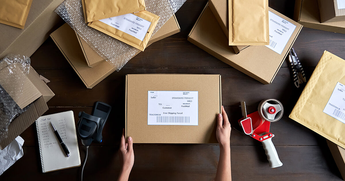
Packaging is that thing that your online brand needs, but usually forgets until the last minute. And that’s easy to see why. When setting up your business, you’ve got your image, product, online store, Unique Selling Propositions and so much more to worry about. So packaging, usually the humble cardboard box, usually gets pushed to the back and forgotten about. Brands that do consider using quality packing supplies from the start are those that understand the difference it can make to their image as well as their operational efficiency.
Antonia Klatt
Last Updated on 7 June 2022
But rather than explain why quality packaging is important (and, since humans are visual creatures), we thought we’d show you 8 small and medium brands that have got custom packaging down to a fine art. Not just because it looks good, but because their packaging helps them stand out, and is almost a marketing channel itself. Whether it mirrors the brand’s colour palette, complements its pledge to sustainability, performs impeccably or is optimised to keep costs as low as possible, there’s much to be learned from the brand’s listed below.
Let’s take a look to the 8 Brands That Have Nailed Custom Packaging Design.

Book a free consultation
Our VAT experts are happy to help you. Book a free consultation today!
Le Petit Trou
Le Petit Trou manufactures luxury and discrete women’s lingerie and nightwear. They call themselves ‘a unique lingerie brand for women in love with fashion’. A statement that sets the tone of what’s to come.
Pay attention to the simplicity and understatedness of their product and image, without being ‘minimalist’. The brand manages to exude a liberal, empowering feeling with a minimal use of colour, but a heavy use of the female form, without being NSFW.

Simplicity is something that we see a lot within Le Petit Trou’s branding. Through their simplicity, they evoke a sense of elegance and exclusivity – two senses that complement their product.
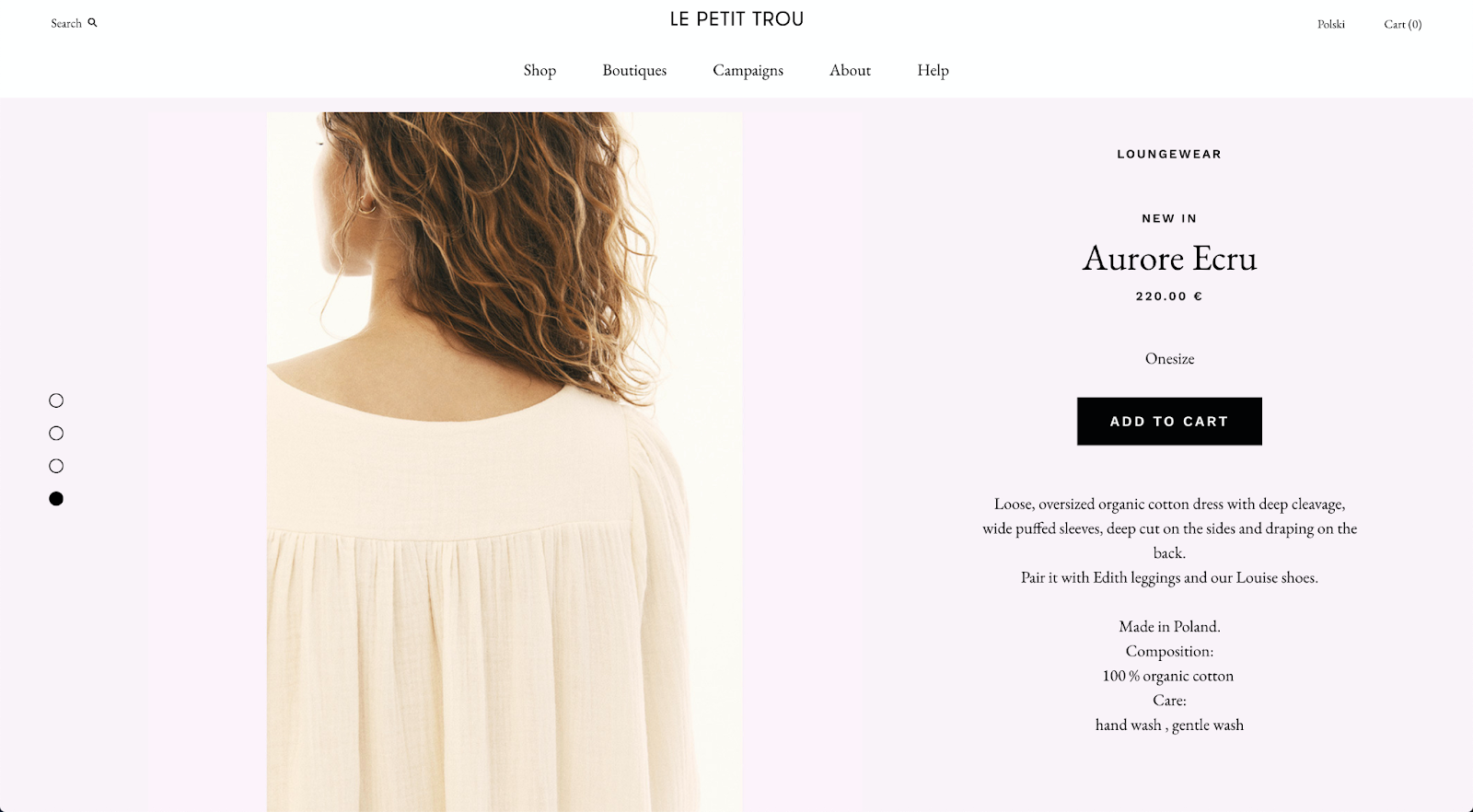
Even their nightgown, a product that many of us would never associate with words like ‘elegant’ or ‘exclusive’, manage to invoke such emotions.
Their Instagram feed echoes this simplicity feeling incredibly well.

As does their packaging, which looks like some form of small yet elegant gift box.

Pay attention to:
- How the brand shows ‘sexy elegance’ without being NSFW
- The use of a ‘thank you’ card to empower customers
- A real focus on providing quality products and making a lasting impression
ANTHEM
Italian streetwear brand ANTHEM takes the skills of local artists, musicians and designs and puts them on their clothing. One of the brand’s core values though is sustainability. The brand uses locally sourced materials for both its garments and packaging as you can see below in their biodegradable mailing bags.
Anthem sells the world over, so security cannot be compromised, but weight must be as small as possible.

Pay attention to:
- The consistent branding on product labels, tags, cards and packaging.
- The use of a ‘thank you’ card to empower customers
- A real focus on providing quality products and making a lasting impression
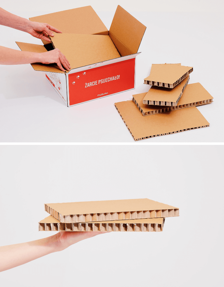
Psi Bufet
Psi Bufet is a Polish subscription box service that delivers fresh, high-quality dog food to your door. And this is the key differentiator that creates a problem. As it’s fresh, the food needs to stay below a certain temperature throughout the delivery process, which can sometimes be as long as 24 hours.
The brand uses all-natural ingredients in their food, so it felt somewhat counterintuitive to use oil-based polystyrene foam. Instead, the team worked with experienced packaging engineers and created a thermally insulated box that keeps temperatures below freezing for up to 24 hours.
Pay attention to:
- The honeycomb weave of the insulating cardboard sheets.
- The use of only recycled FSC-certified cardboard.
- Boxes can be collected and sent back for regular use, or thrown into the recycling
Monokel
Monokel, a Berlin-based menswear brand, flawlessly blends minimalism and quality into their garments. Their understated design is reflected in both their products and their store layout. And their packaging fits into this flawlessly.
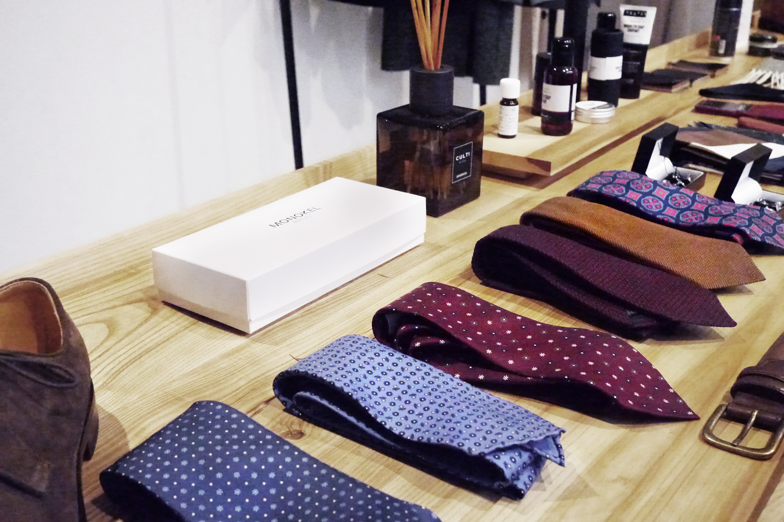
Pay attention to:
- The glossy white box complements the vibrant colours of the clothing
- The consistent understanding of the store fit-out and packaging draws attention to the clothing
March
March is a brand that arguably doesn’t use branded packaging at all.
It is, in fact, their branded tape that’s the focus of their design.

The Austrian brand is all about lavender. Hand soaps, face washes and other skincare products made from Lavender grown on the family-run farm of the two siblings that own the company.
The brand knows the quality of its products. It doesn’t want to shy away from that. So loud and in your face branding and packaging has an adverse effect on what they want to achieve.
The use of plain mailer boxes alongside simple branded tape makes a statement but why it doesn’t say, allowing the product itself to do all the talking.

Pay attention to:
- The harmonious use of colours and textures that match
- A brown, natural colour palette that lets the natural colour of the lavender truly burst
Hemp Juice
The Polish CBD brand, Hemp Juice is tapping into an industry that’s exploded in recent years.
But this brand uses its branding and packaging to stand out in a market that’s saturated with brands making claims that are a little too similar to their own.
Using simple and effective colour theory to distinguish their products from competitors, as well as other products in their own line, they’re able to quickly sell the benefits and create a ‘mood’.
 There’s no ‘stoner’ appeal, and no complex medicinal jargon to process. It’s minimalist, visually appealing and easy to digest. And it’s echoed on their packaging.
It’s modern but also minimalistic. It is calming without being sedative. Vibrant and eye-catching without being loud and in your face.
Pay attention to:
- The use of calming colours to match the benefits of the product
- Calming, but not sedative. Eye-catching without being loud.
Stay Cold
Some brands prefer the subtle way, some brands prefer to be loud and in your face. And German tattoo-wear brand, StayCold is one of the latter types.
Not only is their clothing designed by tattooists, but their packaging is also too. This creates a consistent branding experience between social media, webstore, retail store, product and branding which is the linchpin to the brand’s marketing strategy. When the branding, as prevalent as it is, is consistent, the customer trusts the brand more and trusts them quicker.
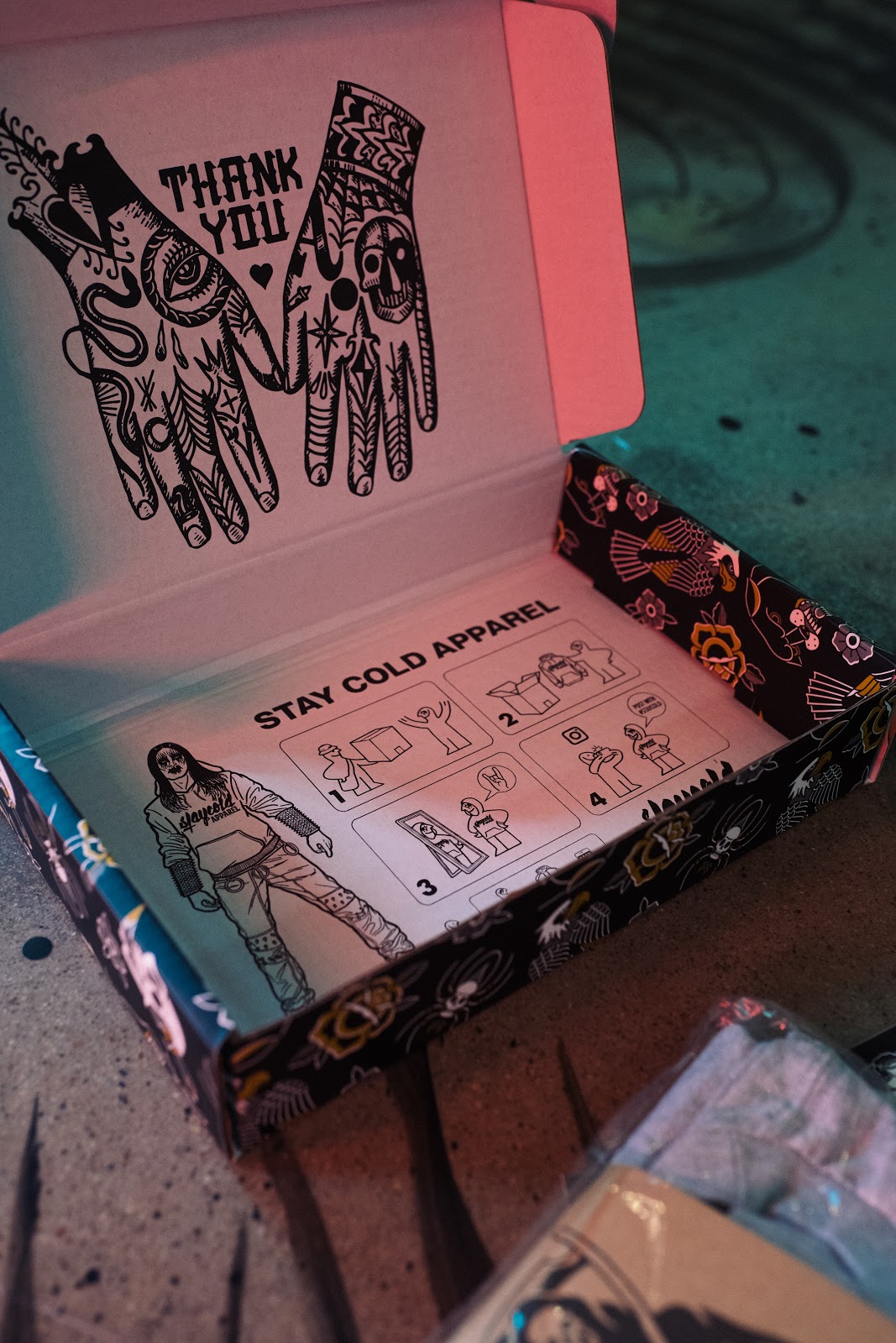
Pay attention to:
- Consistent use of flash-tattoo designs
- Clever way to encourage customers to create user-generated content
- The simple act of saying thanks
Oase
Oase is a retailer of hair vitamins that promote the growth and development of strong, healthy hair. Similar to Monokel, the business is minimalist in its branding, and this is echoed on the packaging. Oase’s high-end packing supplies takes on two forms, that of a rigid external and its base, and the bottle itself.

Pay attention to:
- The similarities between the colour of the supplement and the off-pink colour of the label and external packaging.
- The way that the base acts like a stage that presents the product to the customer
- The way the packaging complements, rather than detracts, from the product itself.
Concrete Jungle
One of the reasons that many ecommerce brands put such effort into packaging is because they know that packaging is the first physical touchpoint between an ecommerce brand and customer. It’s the stage that presents the product to a pair of brand new eyes, and you only get one chance at a first impression. Concrete Jungle has perfected that first impression:

Pay attention to:
- The consistent use of green, gold, black and white.
- Void filler and internal print create a ‘secret surprise’ upon opening the box.
- Clever copy to build excitement and the emotional connection – aka, an unboxing experience.
Brahmaki
Brahmaki is a Swedish boutique that produces high-quality kafkans and yoga-wear. The brand’s focus on meditation, relaxation and mindfulness evokes earthy colours like browns, oranges, as well as blues and greens. These natural tones are carried over onto the packaging design by using the natural texture of the cardboard.

Pay attention to:
- The tessellated logo being repeated on the side of the box
- The earthy tones created by the natural kraft cardboard
- Simplicity. It doesn’t have to be overthought or over-designed to be effective.
Raylo
Raylo leases new phones to consumers for a fraction of the cost of owning them. This means fewer phones thrown out, as the old ones get sent back and handed down. This extra step required a unique operational strategy to be effective, and packaging was an integral part of that. An off-the-shelf solution didn’t work, so Raylo worked with packaging engineers to cut down on material usage without sacrificing performance.
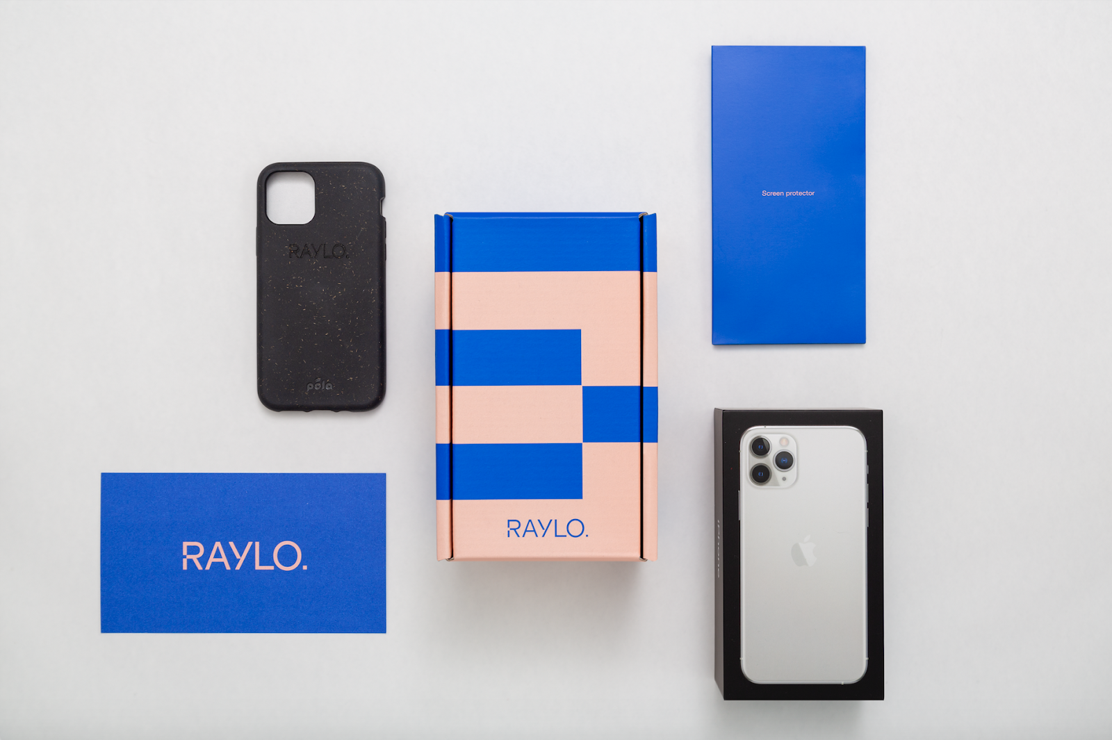
Pay attention to:
- Consistent branding between the website and packaging
- Packaging that hugs the product, keeping is safe and secure throughout shipping
- Durable design to send old phones back to the warehouse
What does your brand’s packaging look like?
You’ve just seen a handful of small to medium brands that have spent the time to create packaging that complements their business, as well as the product.
In all of the examples above, the packaging adds perceived value to the customer and leaves them with a sense of getting more than they paid for.
With a little creativity and resourcefulness, your business can implement packaging that plays a similar role.